Starbucks Rebrand
The Evolution of the Starbucks Logo
The Starbucks logo has evolved and become simpler and simpler over time since their inception in 1971. However, they have always maintained bits and pieces of their original logo such as maintaining the iconic mermaid design while altering it and keeping the circular shape of the whole thing. For my rebrand, I wanted to stick to this idea of just simplifying but by taking it a step further. I used what is arguably the most recognizable part of the mermaid, the crown, as the main piece of the logo and kept the iconic Starbucks green. I changed the font to one with a more modern feel to reflect the growth of Starbucks and a new style of design for the new decade.
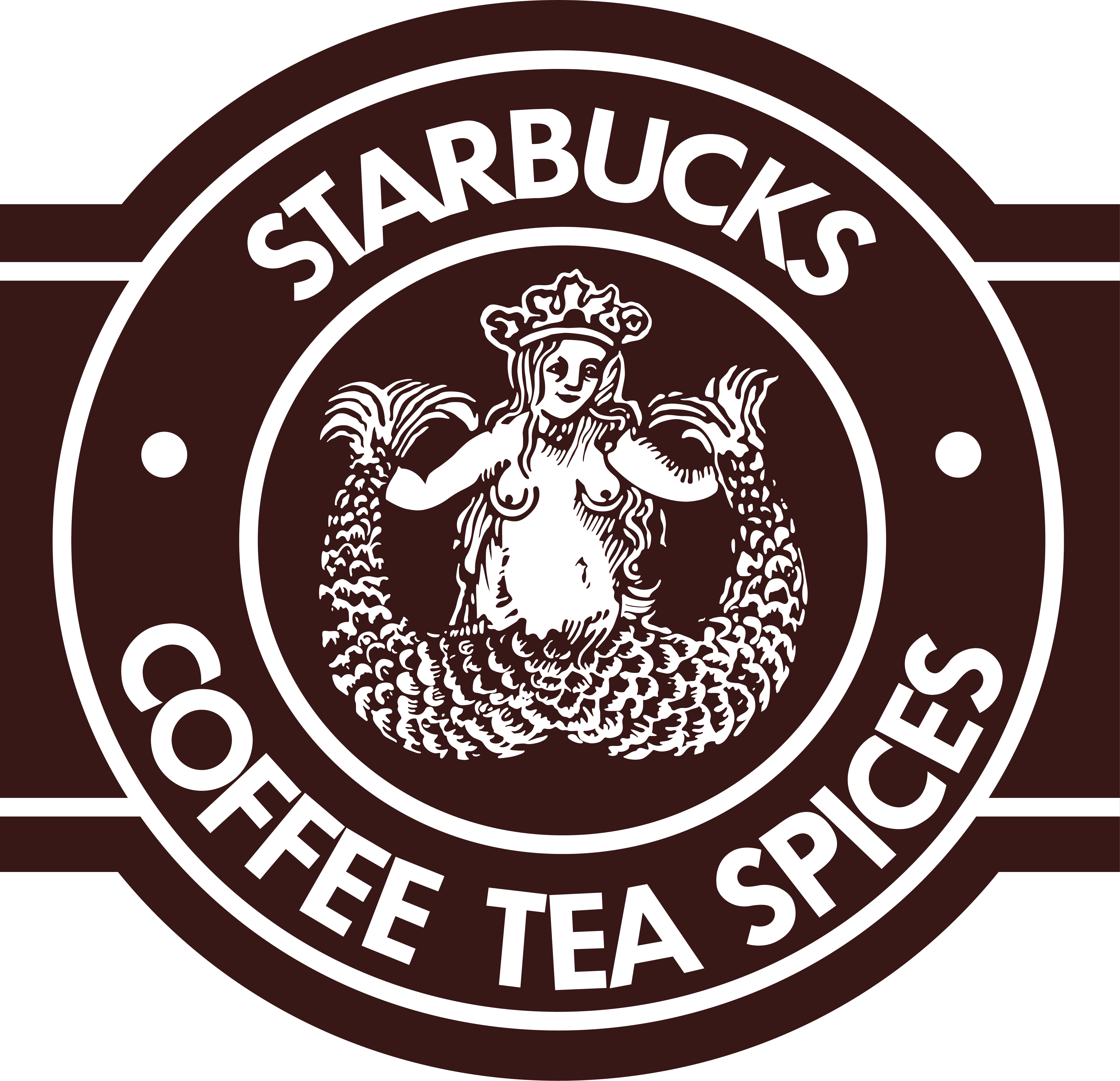
1971
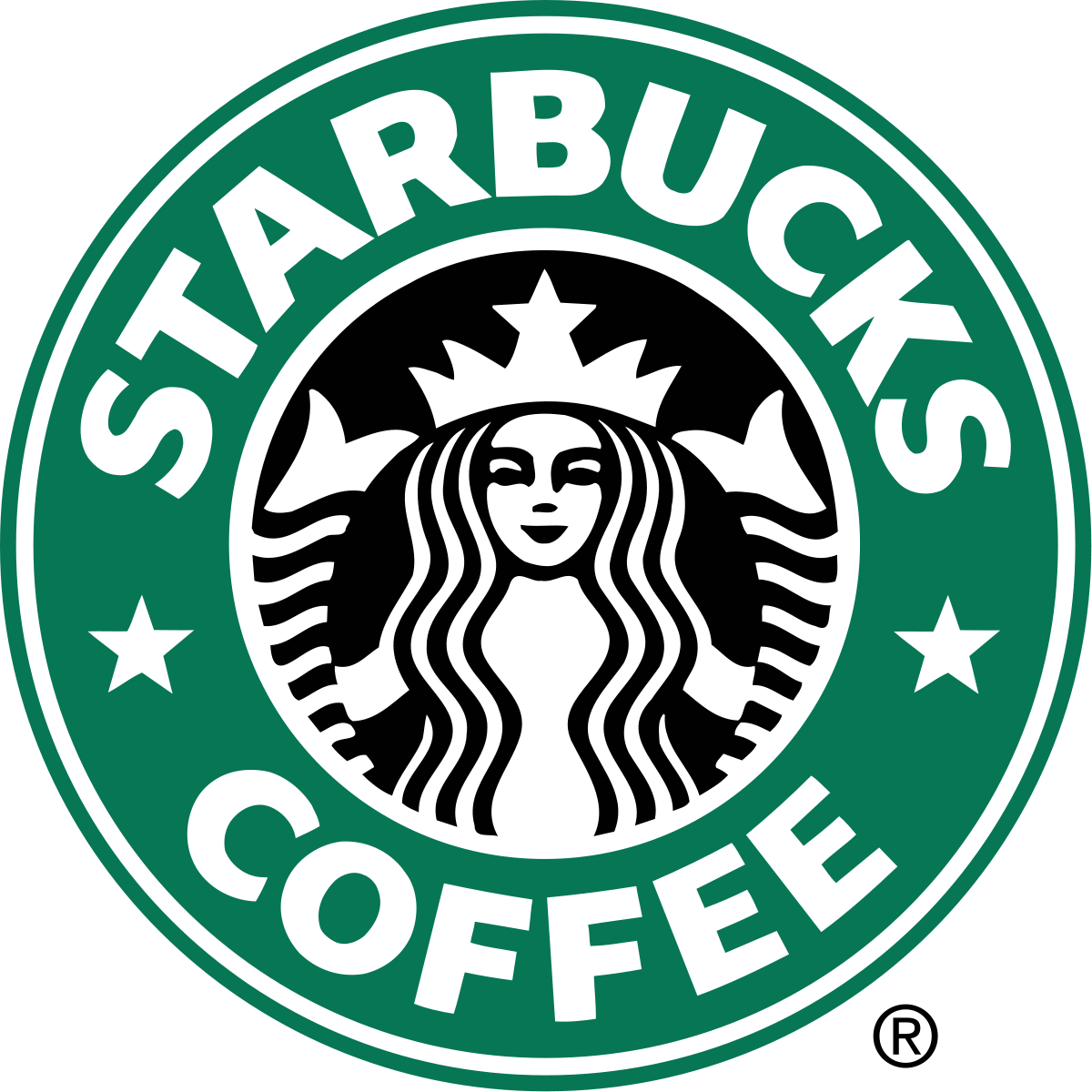
1992
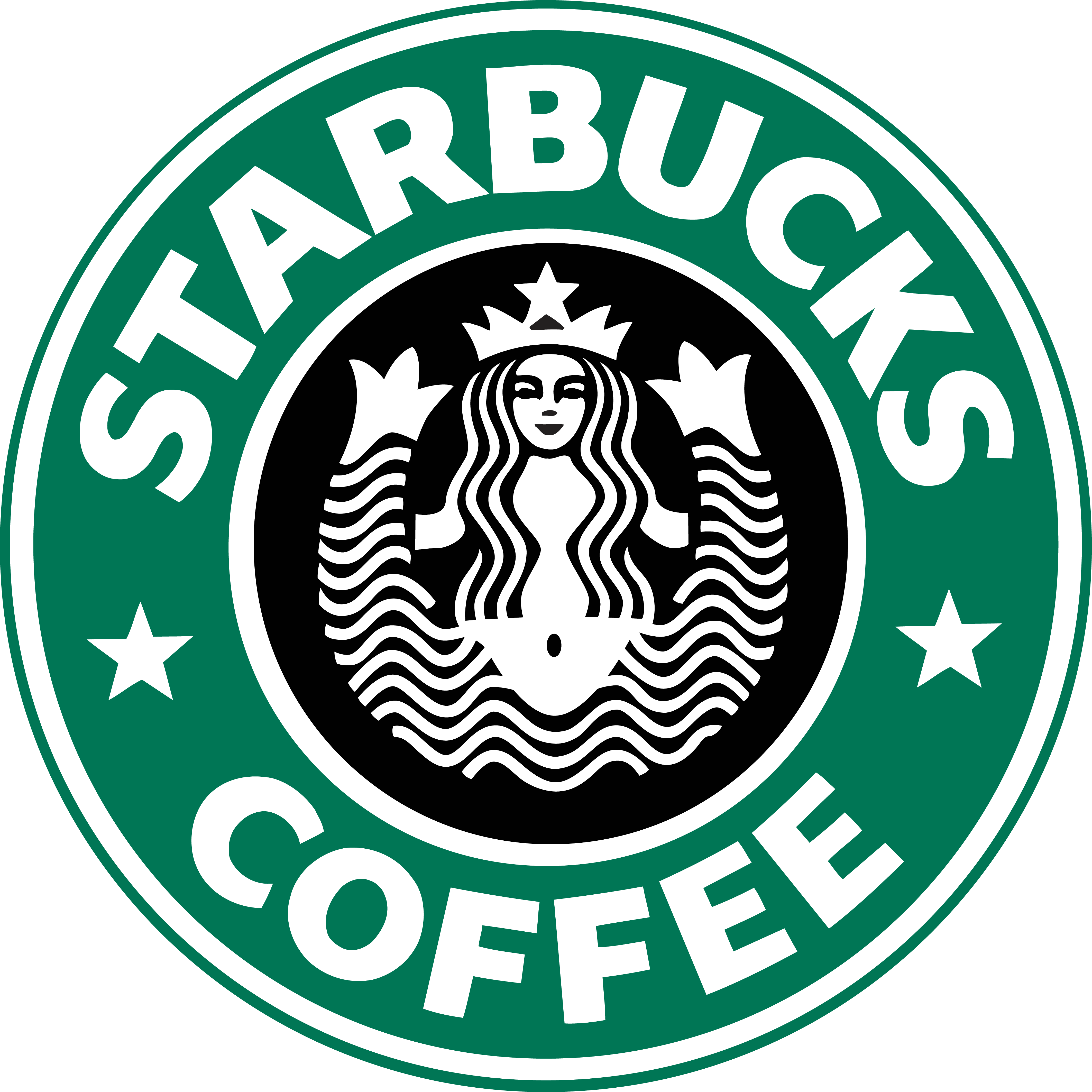
1987
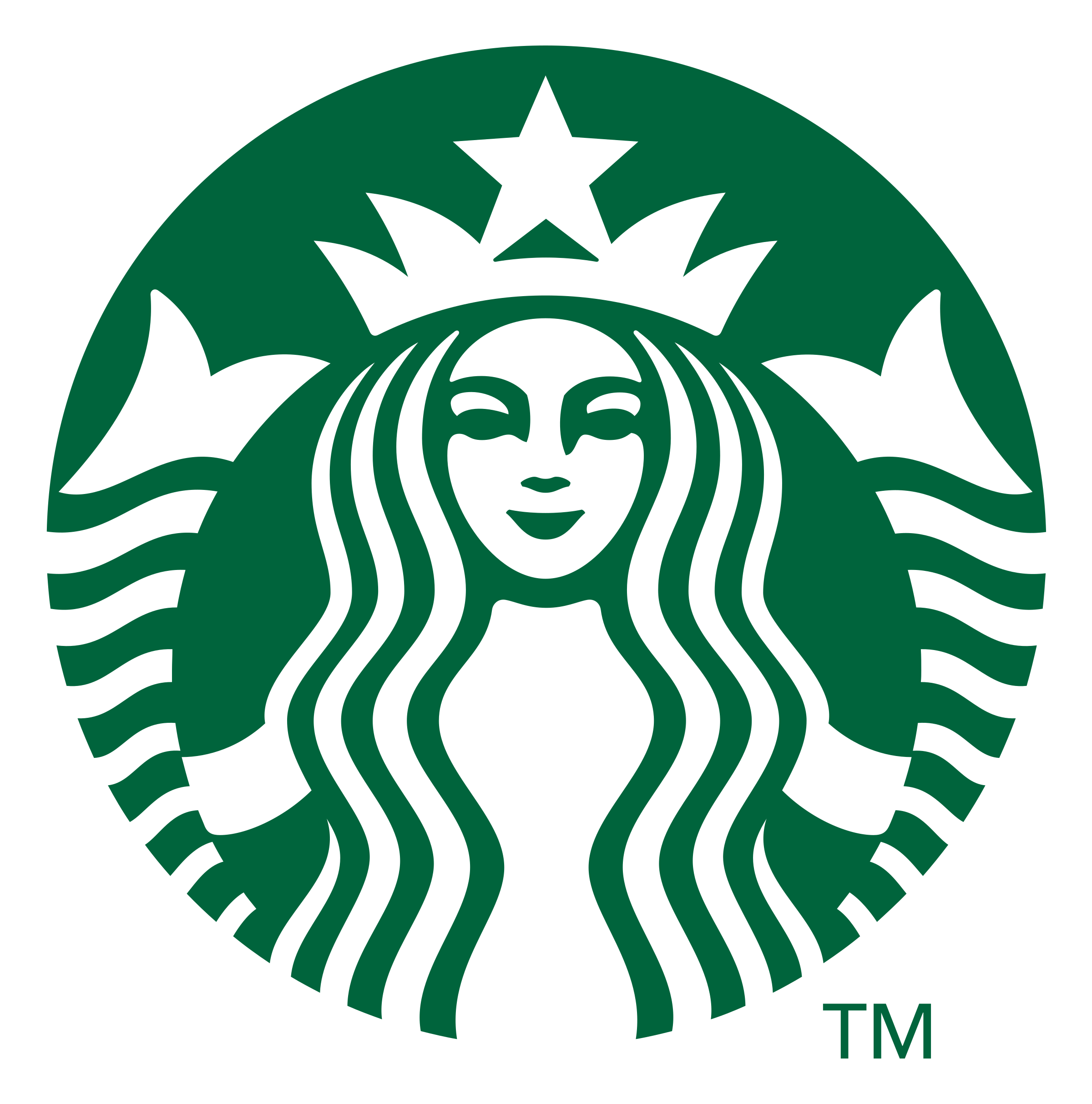
2011
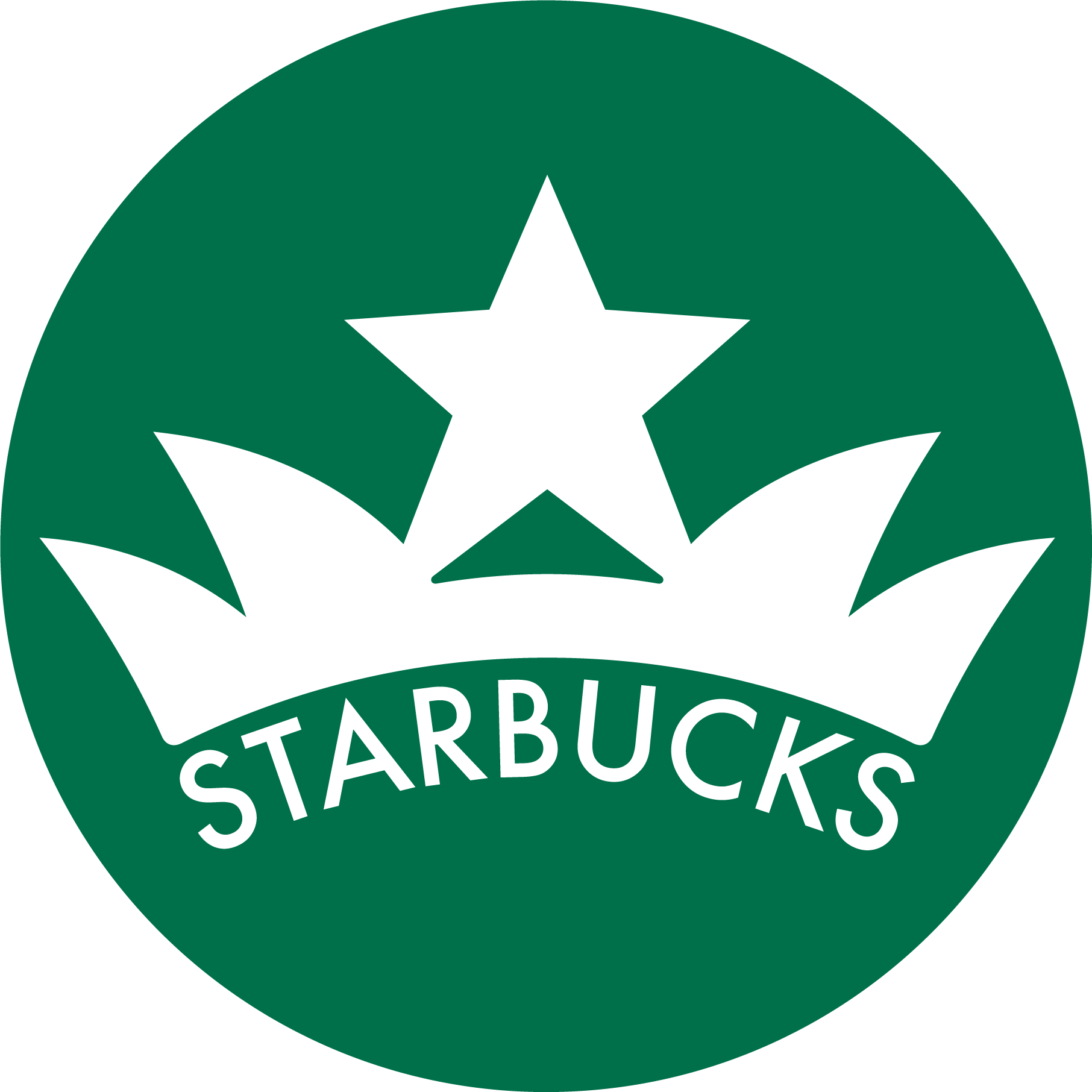
My Rebrand
Design Details
While I maintained most of Starbucks signature design elements, I made slight alterations to them but still kept the brand identity Starbucks has built.

The iconic Starbucks green is a design element that can’t be compromised because of it’s contribution to the brand identity of Starbucks.
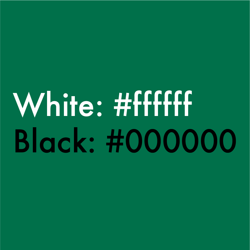
Even though Starbucks green is the main color in their branding they also use black and white as accent colors.

I decided through my rebrand process that a change in font would represent Starbucks in a more modern way. The current font has been used for the last couple iterations of their logo and I think it is a small change to their branding that will alter it but won’t compromise their brand identity.
Mockups
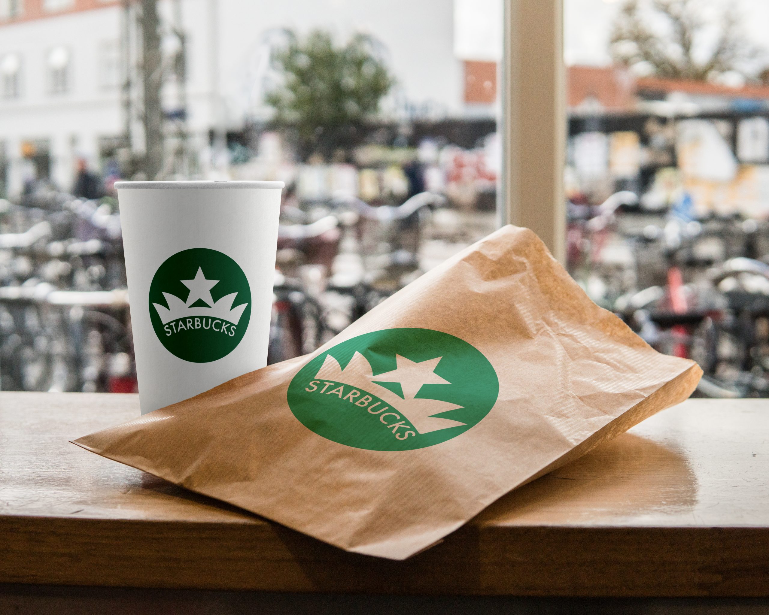
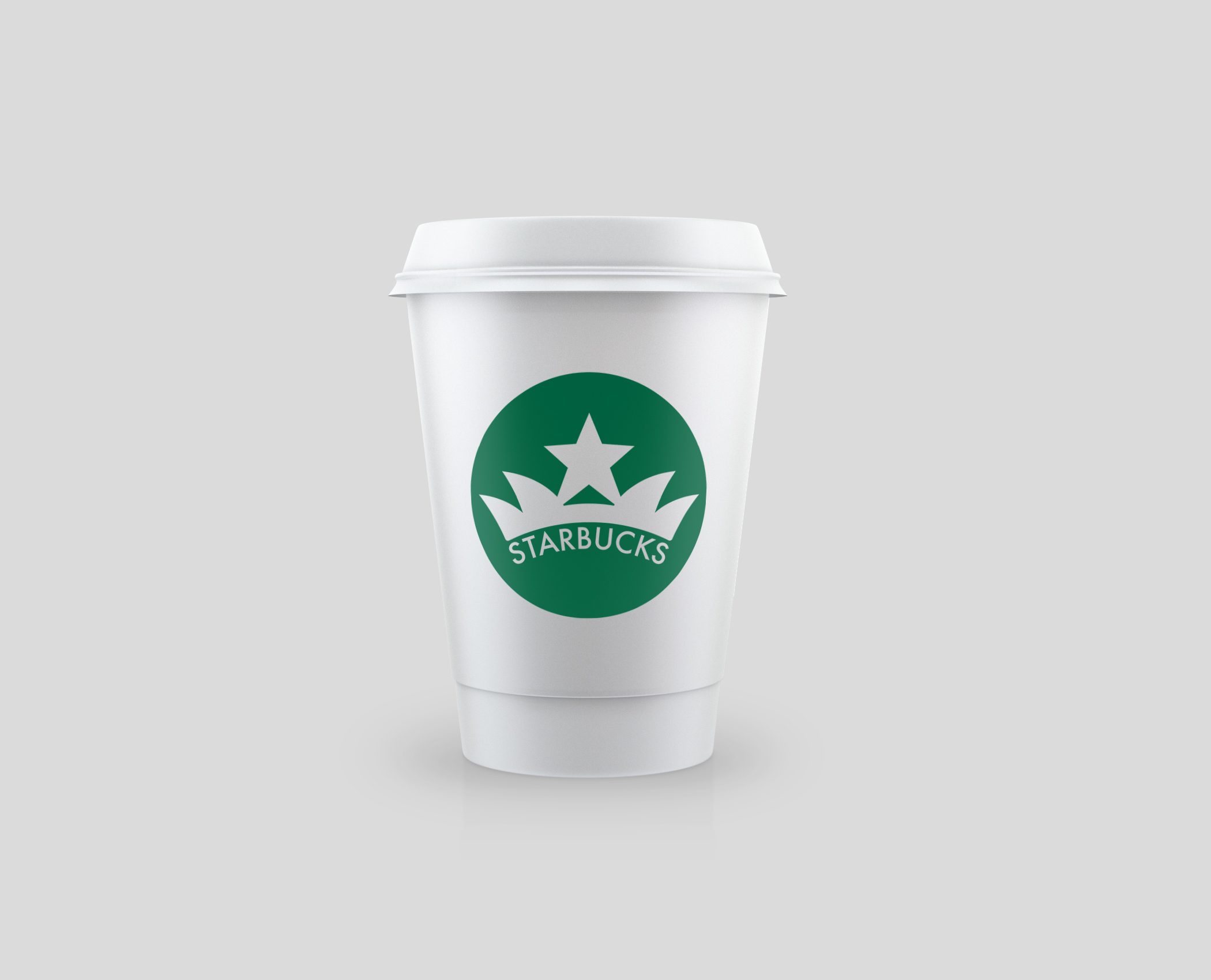
Here is what my rebranded logo would look like in practical usages and on branded packaging.
