Political Campaigns Branding Project

Logo Designs
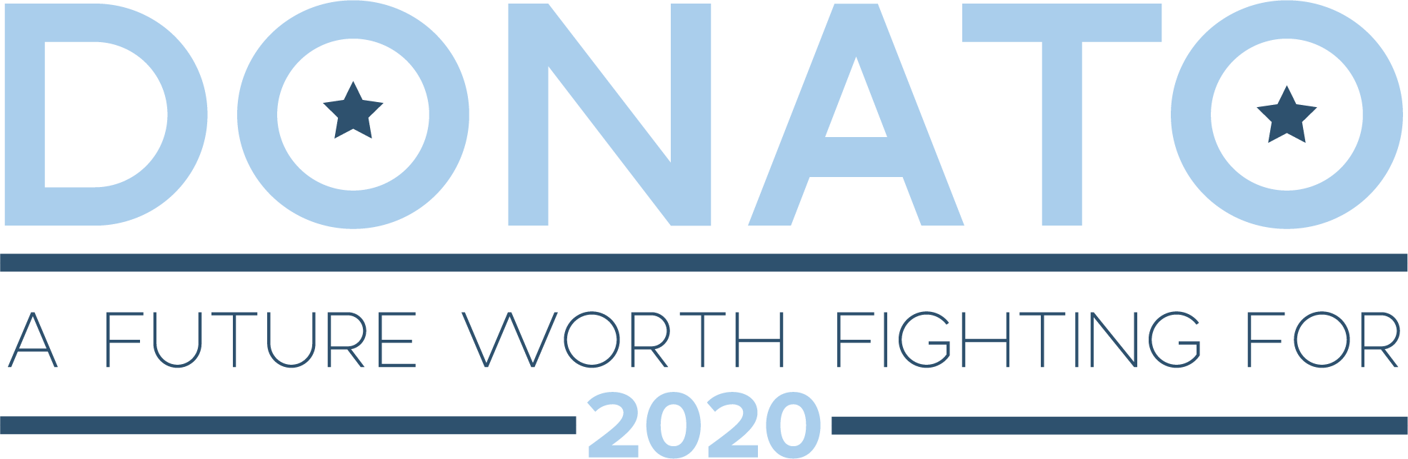
I created two logo iterations; one with the campaign slogan and one without the campaign slogan. I did this because even though each logo is slightly different, they are recognizable as the same brand, thus giving diversity to the assets that can be created using these marks.
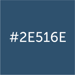
The light blue color in the logo is meant to maintain the connotation of blue within American government, while offering a modern, progressive feel in the mark.
The dark blue color in the logo has the same connotation as the first, however, the darker color leans more towards a traditional feel.

A star is a staple of design in American political branding. The origin of the star in US politics comes from the flag and has held a patriotic connotation since. Adding this to the logo gives a patriotic feel in a subtle way.
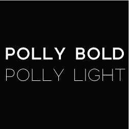
The font choice was determined solely on the modernity and cleanliness of the font. The thin, uniform lines add a modern touch while keeping the text in all capital letters demands attention.
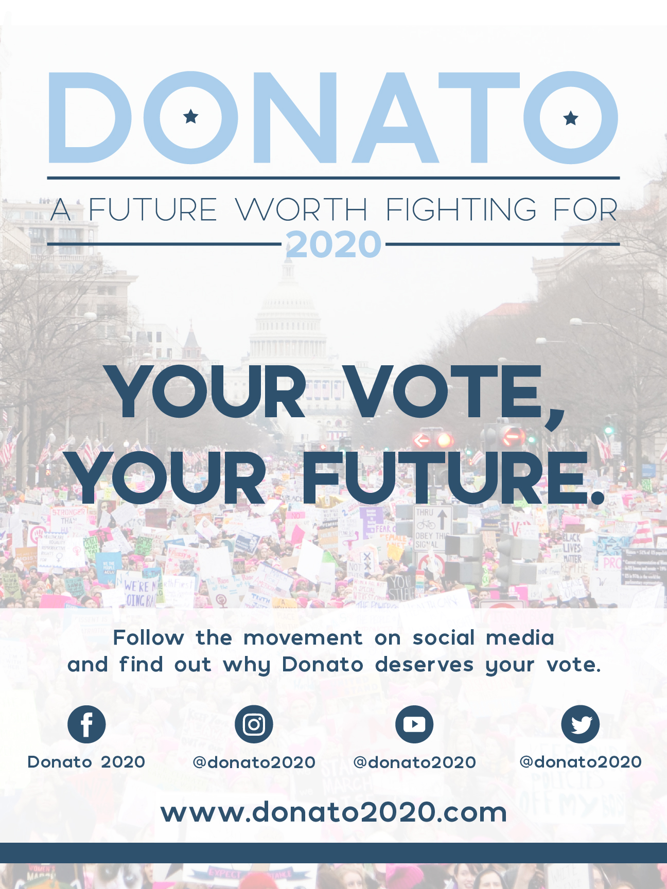
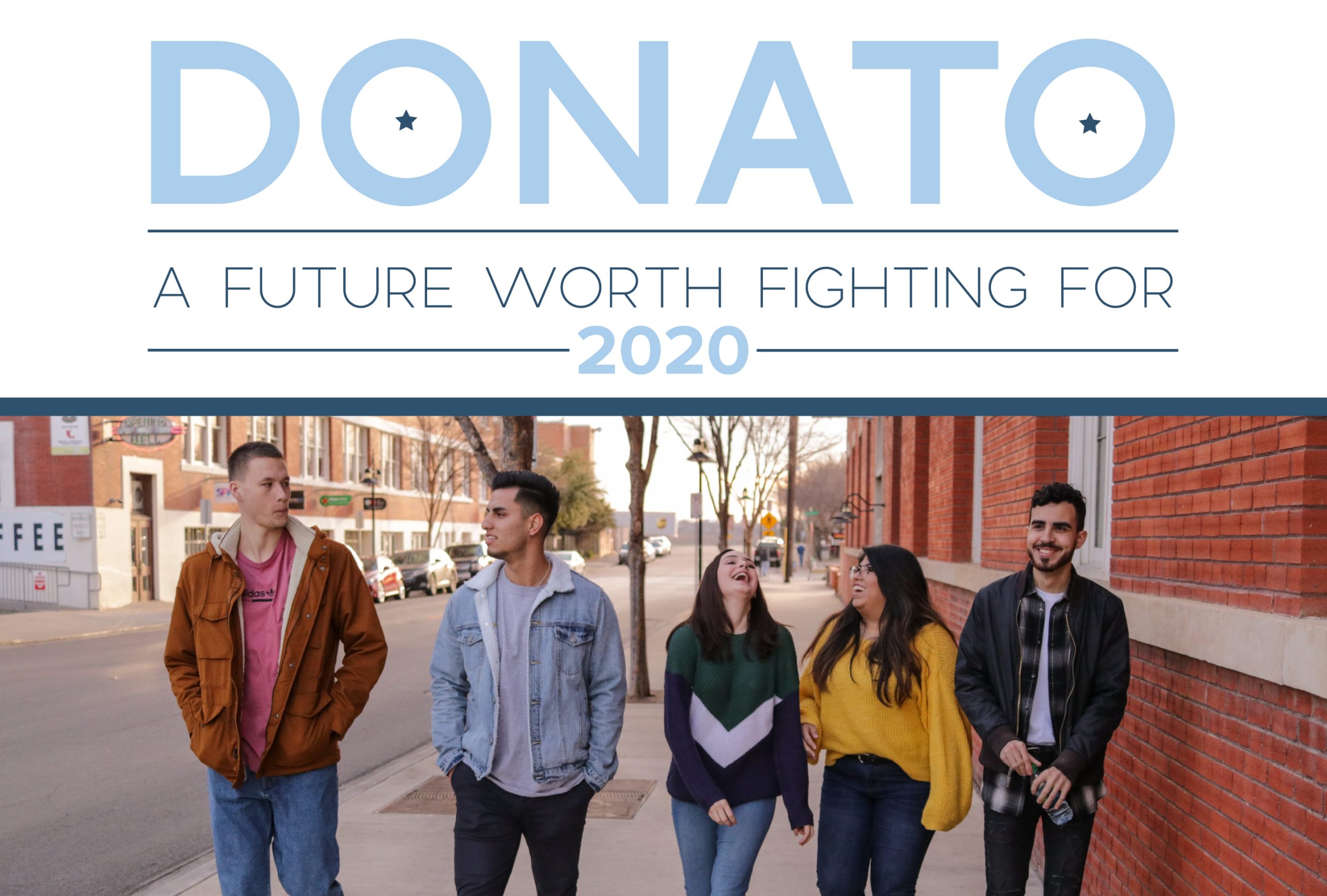
Asset Creation
We were then tasked with creating assets that could be distributed as campaign materials. These materials include social media posts, billboard designs, and flyers.