Birmingham Tourism Rebrand
Before

After
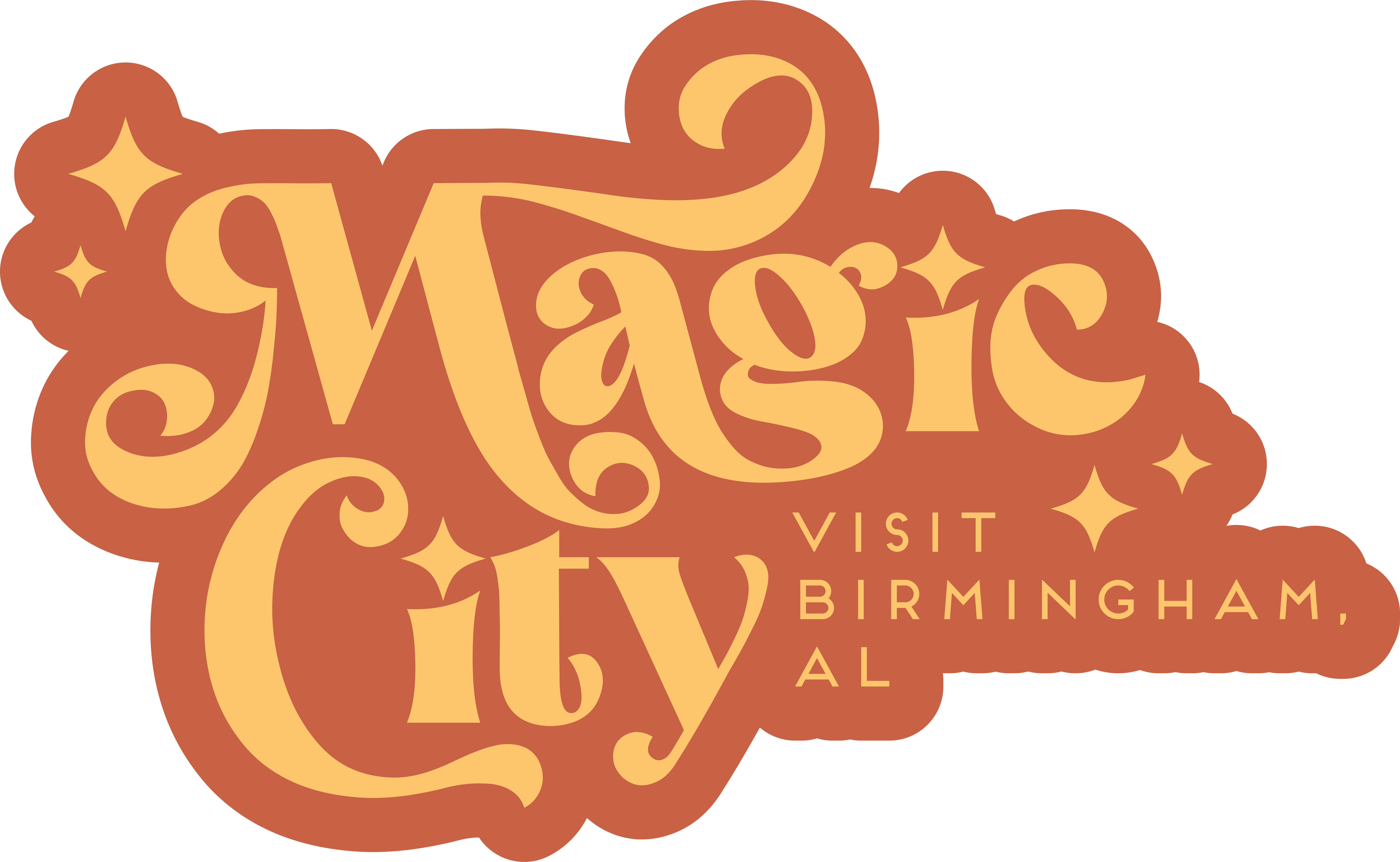
Logo Redesign
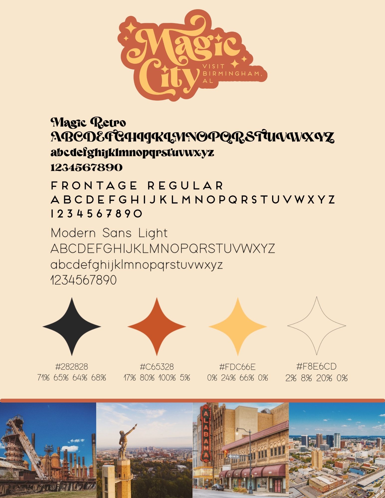
When redesigning the Birmingham tourism logo, it occurred to me that the current logo wasn’t bad; it just doesn’t reflect the rich culture, artsiness, and the young people that inhabit Birmingham. The “In Birmingham” logo makes sense. I get it. However, Birmingham is a lot more than just a bland play on spelling. It has a rich culture; it is, after all, the Magic City. It was one of the civil rights capitals of the country, and it is a place where we can still learn about these things today so as not to repeat them. It has a rich art scene that is continuously growing. Birmingham is home to a growing population of young people from all backgrounds; lgbtq+, foreign migrants, and so many others.
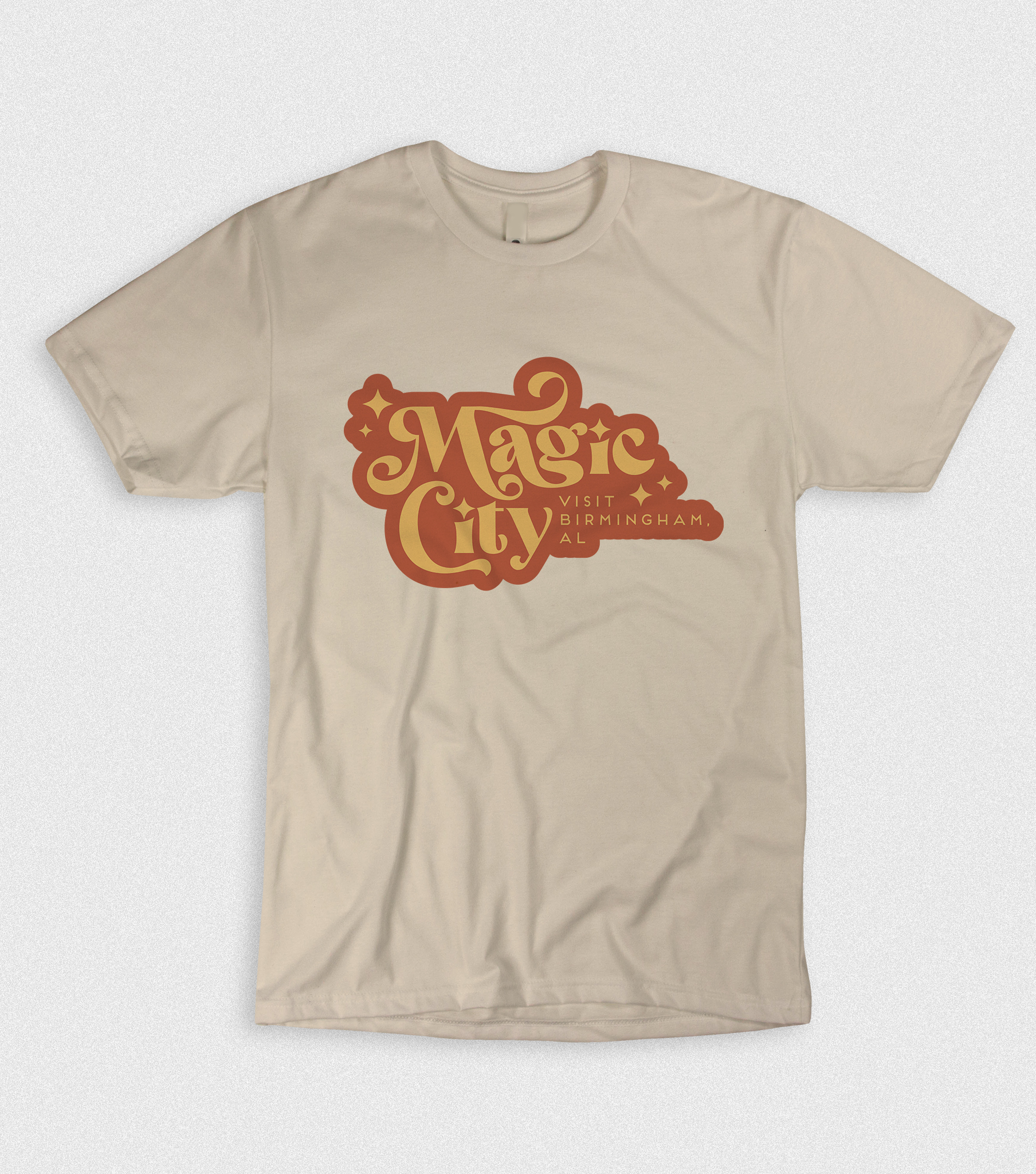
This logo needed a refresh to attract those who wish to see this culturally deep part of the south. Birmingham is the most diverse and arguably trendy place in Alabama, and it needed a logo that reflected that. That is how I came up with the idea of playing on the modern, retro aesthetic. The new logo is inviting, visually appealing, catches your eye, and plays on the artistic side of Birmingham while taking advantage of one of Birmingham’s most famous nicknames, Magic City. Using that phrase creates a sense of wonder and magic that will make people more inclined to consider Birmingham for their events, travels, and more.

The off-black color will be used for elements that need to be easily read. Off-black was chosen because full black was too harsh and gave too much of a Halloween feel.

The burnt orange is bright but also dark enough to maintain contrast from the black and the lighter colors. Burnt orange is on trend but also sticks to the retro feel of the mark.

The bright yellow offers a large amount of contrast in the mark from the burnt orange. It was chosen for its inviting and warm feel and can be used as an accent color in designs.

This off-white was chosen to provide a background color that was in the warm toned family and doesn’t create a stark white difference between the background and other elements.
Static Moodboard
Sample Posts/Ads
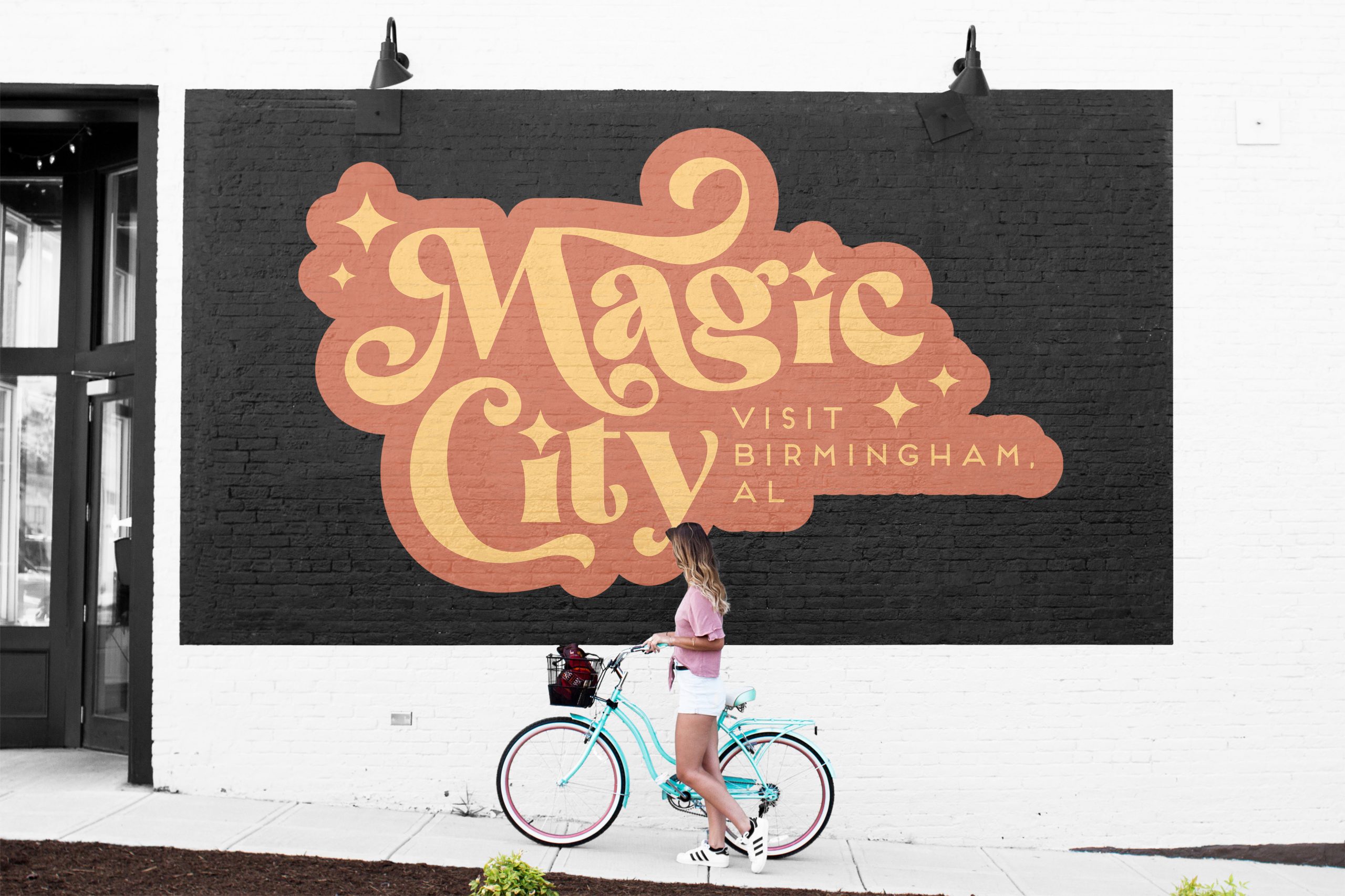
Mockups
