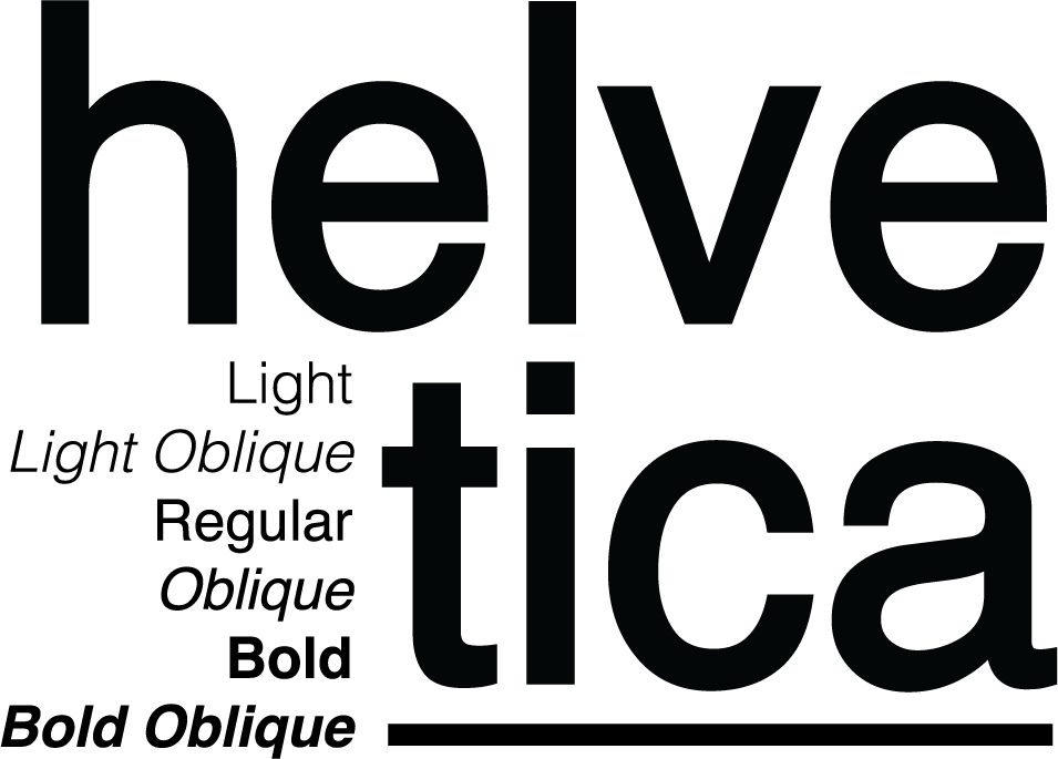
Helvetica Case Study
The Importance of Typography
The definition of typography varies depending on where you find it. But the dictionary definition is “the art or procedure of arranging type or processing data and printing from it.” However, to me, this definition doesn’t capture the importance of typography in design. Typography can drastically change the tone of your design, the emotions elicited from it, the quality and legibility of your design, among many other things.
Typography is important, and arguably, one of the most important and famous typefaces that have dominated the design industry for years is Helvetica.

The Origin of Helvetica
Eduard Hoffmann, the President of the Haas type foundry in Switzerland, created Helvetica out of a need for a new better selling typeface. Their current typefaces were falling behind in sales compared to their competitors, and Hoffman wanted to take advantage of the emerging International Typographic style, commonly known as Swiss Style Design.
Work began on the new typeface in 1956, and it debuted in 1957 as Neue Haas Grotesk. It was an immediate success, and Hoffman made a deal with German typographic foundry D. Stempel AG to make the typeface available for machine composition, making it accessible to a broader audience. In 1960, the typeface was renamed Helvetica to appeal to wider audiences, and thus one of the most famous and widely used typefaces was born.
Why is Helvetica Everywhere?
Helvetica’s neutrality made it a staple for many transportation systems, widespread campaigns, and logos. The inexpressive, “vanilla” nature of Helvetica makes it easily manipulated and is used often in projects that don’t need a font that controls voice and emotions, so much as a font that rejects those things and focuses more on the functionality of a project.
For example, the New York subway system’s signage utilizes Helvetica. Massimo Vignelli, the designer who chose Helvetica for the New York Subway, selected Helvetica for its “functional invisibility” and remarked in the Helvetica documentary that he believed for this project that the type did not need to be expressive of anything.
Famous Logos that Use Helvetica
BMW, Jeep, Target, Verizon, American Airlines, Panasonic, The Northface, Crate & Barrel, American Apparel, LG, and more. These logos slightly change the original typeface by using varied kerning, added strokes, varied weights and types of Helvetica, alignment, added graphic elements, etc. However, when you remove these various edits, the base of each logo is Helvetica.


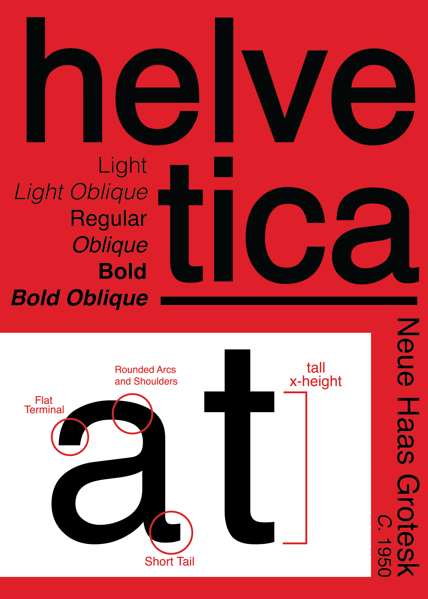
Anatomy of Helvetica
Sans Serif Font, Classified by short tails, flat terminals on every letter, tall x-height which allows for legibility, rounded arcs, and shoulders.

The Downfall and Replacement of Helvetica
Helvetica is a design history icon. However, fewer and fewer designers choose Helvetica simply because more brands are reaching for more custom typefaces to give themselves a memorable edge. Some designers find Helvetica to be a lifeless and dull font. Several updated versions of Helvetica now exist that vary in size and have updates to letterforms and legibility; Helvetica Neue ca. 1983 and Helvetica Now, which comes in a whopping 96 styles.
Other alternative fonts that offer the same legibility and functionality but hold increased personality and feel are Noirden Sans, Solo, Proxima Nova, and more. Designers are reaching for fonts like these because although they are incredibly similar, they move away from the Swiss Style and more into the contemporary space design that design is in now.
Sources:
Fussell, Grace. “Everything You Wanted to Know about Helvetica.” Design & Illustration Envato Tuts+, Envato Tuts, 16 July 2019, design.tutsplus.com/articles/everything-you-wanted-to-know-about-helvetica–cms-33404.
Alioto, Mary Jane. “Typography Basics Breakdown.” Medium, UX Collective, 26 July 2020, uxdesign.cc/typography-basics-breakdown-603013198c3c.
“Everything You Need to Know about the Helvetica Font Family.” Visual Hierarchy Blog, 25 Apr. 2018, visualhierarchy.co/blog/the-helvetica-font-family/.
Alyssa, Marketing & Branding Strategist. “The International Style: Graphic Design Livermore.” Designflair, 4 Sept. 2015, designflairstudio.com/the-international-style-modern-graphic-design/.
Strizver, Ilene. “Anatomy of a Character – Fonts.com.” Fonts.com, www.fonts.com/content/learning/fontology/level-1/type-anatomy/anatomy.
